Why I Switched to Aerospace: Tiling Window Management Made Easy on macOS
Discover how Aerospace, a tiling window manager for macOS, simplifies window management and boosts productivity. Learn about its powerful features, easy setup, and tips for mastering your workflow on macOS.
It's rare to see productivity significantly improve just by installing a single app. Even apps with bold promise often require some effort to configure and get to used to. This is especially true for keyboard-centric software aimed at power users. I’ve seen people perform magic with highly customized Vim setups, navigating and editing code at lightning speed, but such proficiency doesn’t come overnight.
That's why I was surprised by how quickly I became productive on macOS with a tiling window manager called Aerospace. Tiling window managers can sound intimidating, often seeming like tools designed for terminal-focused, tech-savvy users. Aerospace itself even warns that it’s “targeted at advanced users and developers.” However, the reality turned out to be much more accessible.

Aerospace allowed me to fully utilize macOS’s concept of organizing apps into “desktops”. Aerospace refines this idea with its own “workspaces,” offering an intuitive and efficient alternative. In this post, I’ll cover how Aerospace works, how I use it, and which features allowed me to integrate it smoothly from day one.
Installation
I won’t replicate the documentation here, so here’s a link: Aerospace Installation Guide. If you use Homebrew, simply run brew install --cask nikitabobko/tap/aerospace.
Tilling window manager
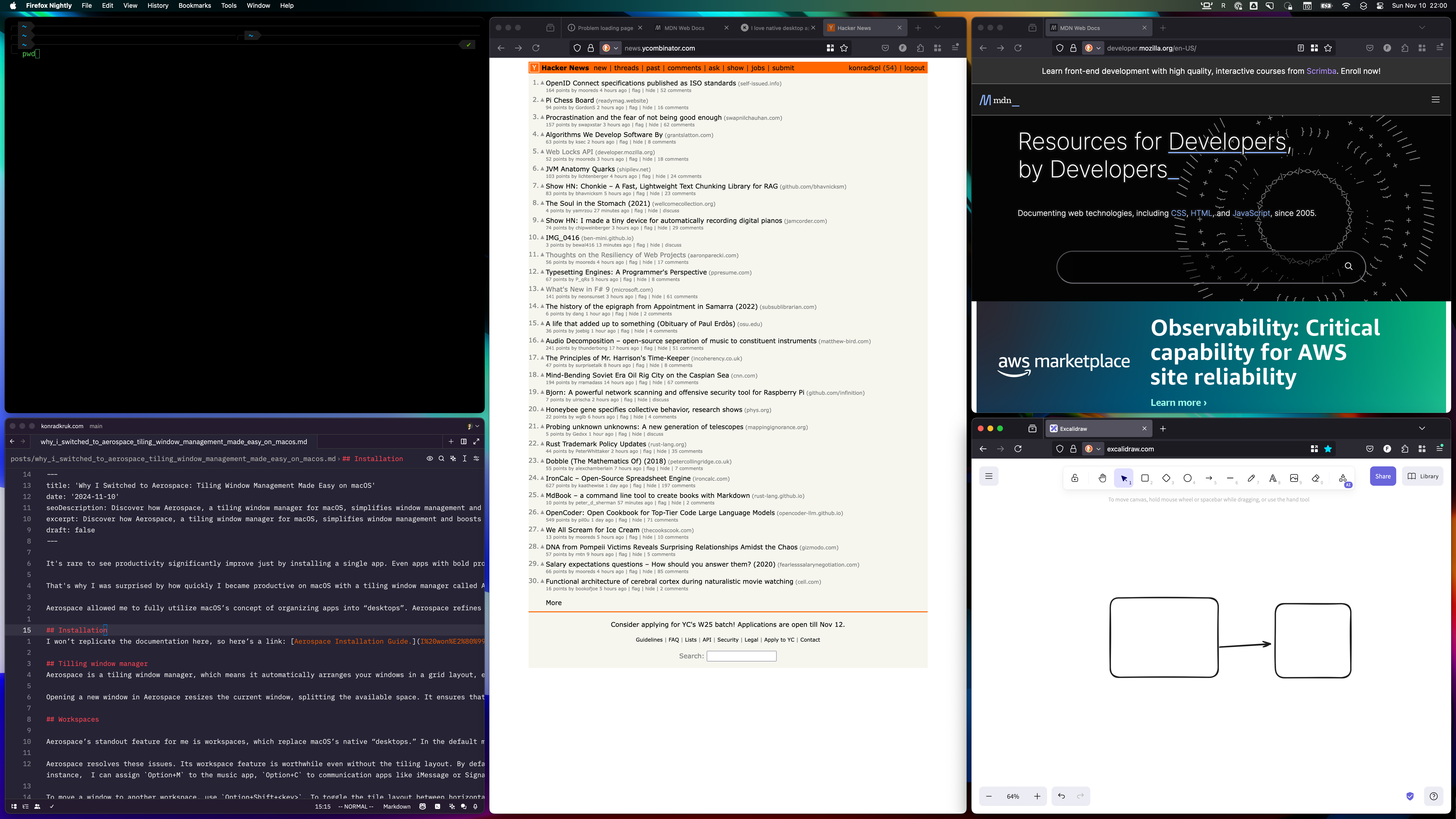
Aerospace is a tiling window manager, which means it automatically arranges your windows in a grid layout, ensuring all windows are visible simultaneously—a departure from macOS’s default overlapping setup. You can float specific windows if desired, and by default, some apps, like system settings, don’t tile.
Opening a new window in Aerospace resizes the current window, splitting the available space. It ensures that each open window has its own space and all of its content is visible. This behavior has an interesting side effect: forces me to decide if all windows I currently see are essential or if I’m okay with sacrificing the dimensions of the current window. If not, I have an alternative solution: opening a new window in another workspace.
Workspaces
Aerospace’s standout feature for me is workspaces, which replace macOS’s native “desktops.” In the default macOS setup, desktops are listed in sequence, and navigation shortcuts only allow moving to the next or previous one. The transitions also have animations that can slow down navigation. Managing multiple displays with desktops is similarly cumbersome.
Aerospace resolves these issues. Its workspace feature is worthwhile even without the tiling layout. By default, Aerospace assigns a workspace to each alphanumeric key. You can switch between workspaces using shortcuts like Option+1, Option+2, Option+Q, Option+W, etc. The idea of using digits to navigate between “desktops” isn’t new; many tiling window managers configure this by default. However, setting up workspaces for every letter key is something I haven’t seen, and I think it’s great. For instance, I can assign Option+M to the music app, Option+C to communication apps like iMessage or Signal, and Option+U to Ulysses for note-taking. This default setup, created by the Aerospace developers, allowed me to discover these possibilities with ease.
To move a window to another workspace, use Option+Shift+<key>. To toggle the tile layout between horizontal and vertical, press Option+Shift+/ or Option+Shift+,. More layout modification options are available by entering “service mode” with the Option+Shift+; shortcut. In this mode, you can merge the current window with others, choosing the joining direction with the Option+Shift+<H|J|K|L> shortcut.
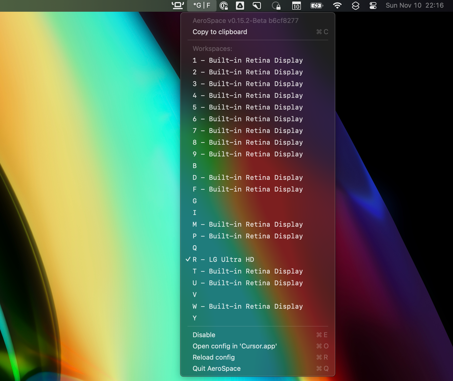
Aerospace adds very handy menuBar widget. It shows currently active workspace. It also shows asterisks when using the service mode.

External display
Attaching an additional display works seamlessly; it can show any existing workspace. You can move the current workspace between external and built-in displays using the Option+Shift+Tab shortcut, solving my previous window management challenges in this setup.
Configuration
Aerospace doesn’t have a GUI for configuration editing, but personalization is possible by editing a text config file.
To edit default configuration, you need to copy default template to your home directory:
cp /Applications/AeroSpace.app/Contents/Resources/default-config.toml ~/.aerospace.toml
In this file, you can adjust all shortcuts, visual elements like window gaps, and various behaviors. For instance, I had to disable all workspaces that conflicted with Polish characters. To type letters like ą, we use Option+A, which Aerospace overrides with a workspace shortcut. I could have changed the shortcut for this workspace, but I chose to disable conflicting workspaces entirely.
What could be improved
What I miss most is a highlight for the currently focused window. I understand the creator’s goal of keeping Aerospace minimal and “practical,” as they note on their website:
Provide practical features. Fancy appearance features are not practical (e.g. window borders, transparency, animations, etc.)
I’m not looking for features available in tools like Hyprland, which offers animations and advanced styling. However, a subtle border change would be an excellent addition, making the app complete for my needs.
Summary
Reading this post might give you the impression that there’s a lot of logic and shortcuts to remember, but in reality, you can start using it comfortably within minutes. Begin with shortcuts to switch workspaces and move windows between them to quickly organize your screen. After three weeks with Aerospace, I feel like I’ve finally managed the chaos of window management.