I love native desktop apps, I will miss them
My favorite applications that I use on macOS are those whose interface was built using native APIs. In the post I describe my favorite advantages with examples and explain why I would choose web technologies for my own app.
Native apps and native UI
In one of the podcasts I listen to, guests at the end of the program are asked to list their favorite applications and SaaS they use at work. I started to thinking what tools I would list. I use a lot of apps, but I realized that my list of favorites is unusual. My list of the most valuable tools includes only native desktop applications. With a native user interface. Not websites launched using tools such as Electron. Classic applications written as the developers of the operating system intended.
In this post, I focus only on macOS desktop applications. I use them most often as I try to limit my activity on the phone to the browser and chats. However, the problems and technological solutions described in this post are often also valid for mobile platform.
Little things that are nice about them
Reusable components
Native interfaces on macOS are built from pre-made components and patterns prepared by Apple for developers. This is somewhat limiting, but restrictions often help maintain consistency and provide a better user experience. It's easier to start using applications where you know where to find the menu, search or what a given button can be used for. Even though the finder file manager and the Pixelmator Pro image editor are completely different applications, you can see many common elements. The tabs look exactly the same, many buttons have exactly the same icon. This makes onboarding unnecessary and the user immediately knows how to use the application.
Beyond the window

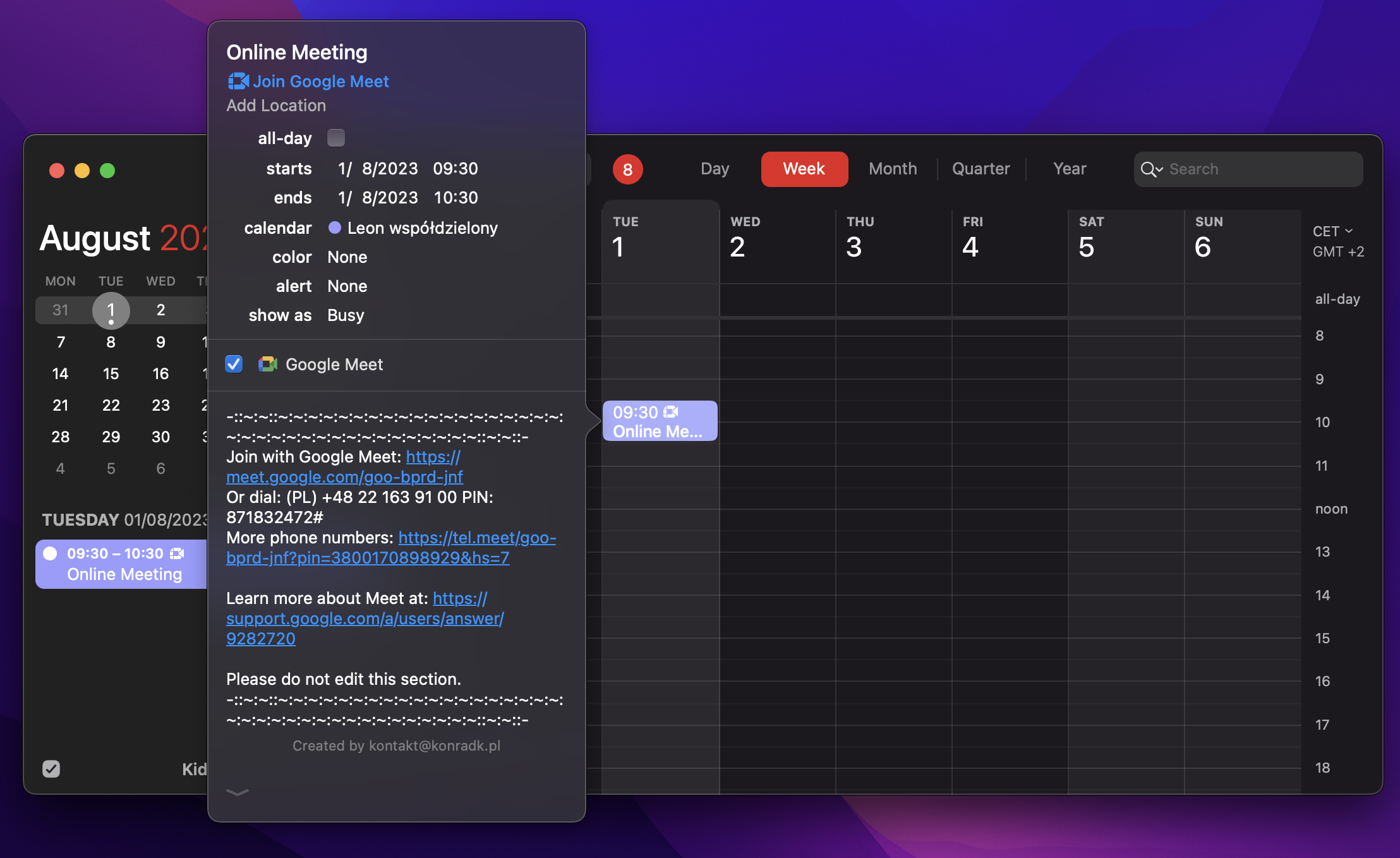
I like native apps because of details. Many little details. Little UI details that distinguish them from apps built using other approaches. E.g. tooltips, dropdowns or various types of popovers. If the application is native and the window is not maximized, the tooltip will open using all available space on the screen. So, for example, it will go beyond the edge of the window. A total detail and nuance that users probably are not aware of, but which I value very much. Such as Fantastical, which will use the entire height of the screen to show the details of the event.
Menus

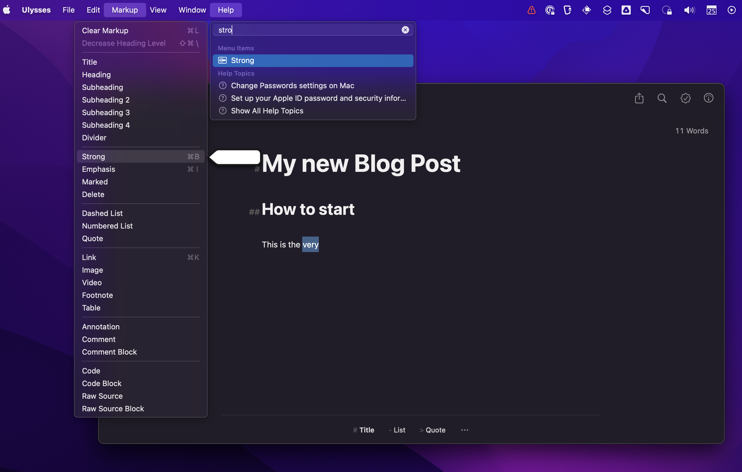
Most of the functions of the native application will be available in the top menu. If you know what you are looking for, you can use the search from the Help menu, which will show you the location of a specific option. I know, this is something that web applications can also do, but their developers do not often use this option. The menu is empty or contains only a few items that do not reflect what the application can do. Like, for example, Ulysses, the application I used to write this post, which allows you to find any option related to content formatting.
Deep integration with operating system

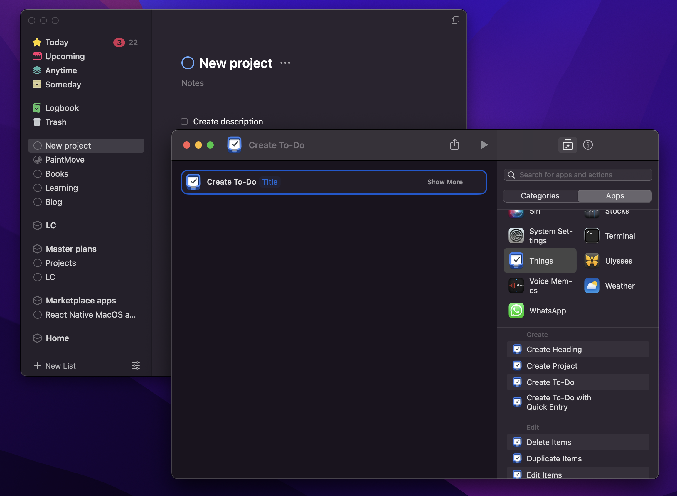
The fact that the application is native also gives some hope when new opportunities appear. I am always happy to watch the WWDC conference, where Apple announces a new version of the operating system. Almost every new macOS version provides new possibilities for developers to integrate with the system. New ways to try to improve user experience even more. E.g. Shortcuts. Applications can publish actions that can be used to create own shortcuts, something like macros. Shortcuts can be activated via Siri or added as an icon on the phone. In this way, I built a shortcut that allows me to quickly add a new item to the shopping list in the Things app, which I use for todo lists. Similarly with widgets, or using the touch bar (as we know, this concert didn't catch on), dark mode or menu bar widgets.
Of course, the use of these possibilities also exists if someone makes an application with a Electron. However, they rarely use them. Usually, an application with a web interface is designed as multi-platform, so developers are reluctant to use the possibilities available only on one platform. Users of native apps however expect developers to adapt new APIs. Developers feel pressure and update products very quickly if a new API prepared by Apple fits the type of their application.
Speed of development
Native applications are compiled and contain application code that uses libraries provided by the operating system. They take as much disk space as they have to, they usually are fast by default. In the case of web applications, the situation is different. The application is distributed with the entire web browser only to run the application written using web technologies. This is the starting point for the application to take up a lot of space and you have to put in a lot of effort to make it work quickly.
The fact that the application is native does not automatically mean that it will be faster than its web counterparts. Every year I check how the Music service from Apple works and how it relates to Spotify. Although Spotify is mostly a web application, it works incomparably better than Music. From clicking play to starting playback, milliseconds pass, where in the case of Apple Music you often have to wait several seconds. Browsing music and loading song details, lists or graphics is also much less brisk than in Spotify. Spotify is a really good app that is not built with a native UI.
Why App Developers Don't Build Native Applications
If applications with native UI are so good and liked by users, why don't developers make more of them and use e.g. Electron solutions?
Web applications have other advantages that are so great that it is worth giving up the satisfaction of some users. Having an application running in the browser, it's easy to convert it into an installable application. Such an application works on many operating systems and looks the same - you don't need to write the interface from scratch for each operating system separately. You can build a team of JavaScript programmers, and you will use the same technology to create a website, application, web services. There is the possibility of an update that does not require any action from the user.
All this makes you able to act very quickly. Quickly implement changes with a small team and distribute them to a large group of users. Finding a market fit, examining many hypotheses requires speed, and web applications have the greatest advantages here. And the advantages of native technologies are diminishing. New web technologies and APIs added to browsers, such as WebAssembly and WebGPU, allow you to create very advanced and demanding applications. This makes founders and developers eager to take this direction.
A big advantage is also when your application works in a browser, and at the same time the user can install it on their device. Such an installed application works and looks almost identical to its web version, so the user does not have to learn how to use it again or go through onboarding.
I understand that. As a product manager and developer, in most cases I would not start creating applications for one platform using native technologies. This is better for the product and a bit worse for a very small specific group of users for who will reject the web application at the start.
Future
As always, when we have a choice of two options with their advantages and disadvantages, there are solutions that try to combine both approaches.
One of them is React Native, which has settled for good on mobile. Thanks to this technology, it is possible to create native applications for iOS and Android using web technologies. It is also possible to share most of the code between implementations on both platforms. There is also React Native for Windows + macOS that was created by Microsoft.
I managed to build a desktop chat application, but I encountered many bugs along the way. Some of them were fixed in subsequent early releases of React Native for macOS. The documentation itself is very poor, the whole thing does not give the impression of a ready-made production solution, even though Facebook used this technology to release a desktop version of Messenger for macOS. Despite this, I really like this approach, I would gladly examinate it in the future to create applications.
Another approach is Apple's Mac Catalyst, which allows applications written for the iPad to be converted to be used on the desktop. Apple, presenting this solution at the WWDC 2019 keynote, shown the Atlassian Jira application, which used this technology. The app itself was very weird and not usable at all at first. Very strange things were happening in it, e.g. controls that looked like dropdown opened modal windows. With each new version, the application was slightly improved, but it was still a strange creation. Finally Atlassian decided to abandon its development.

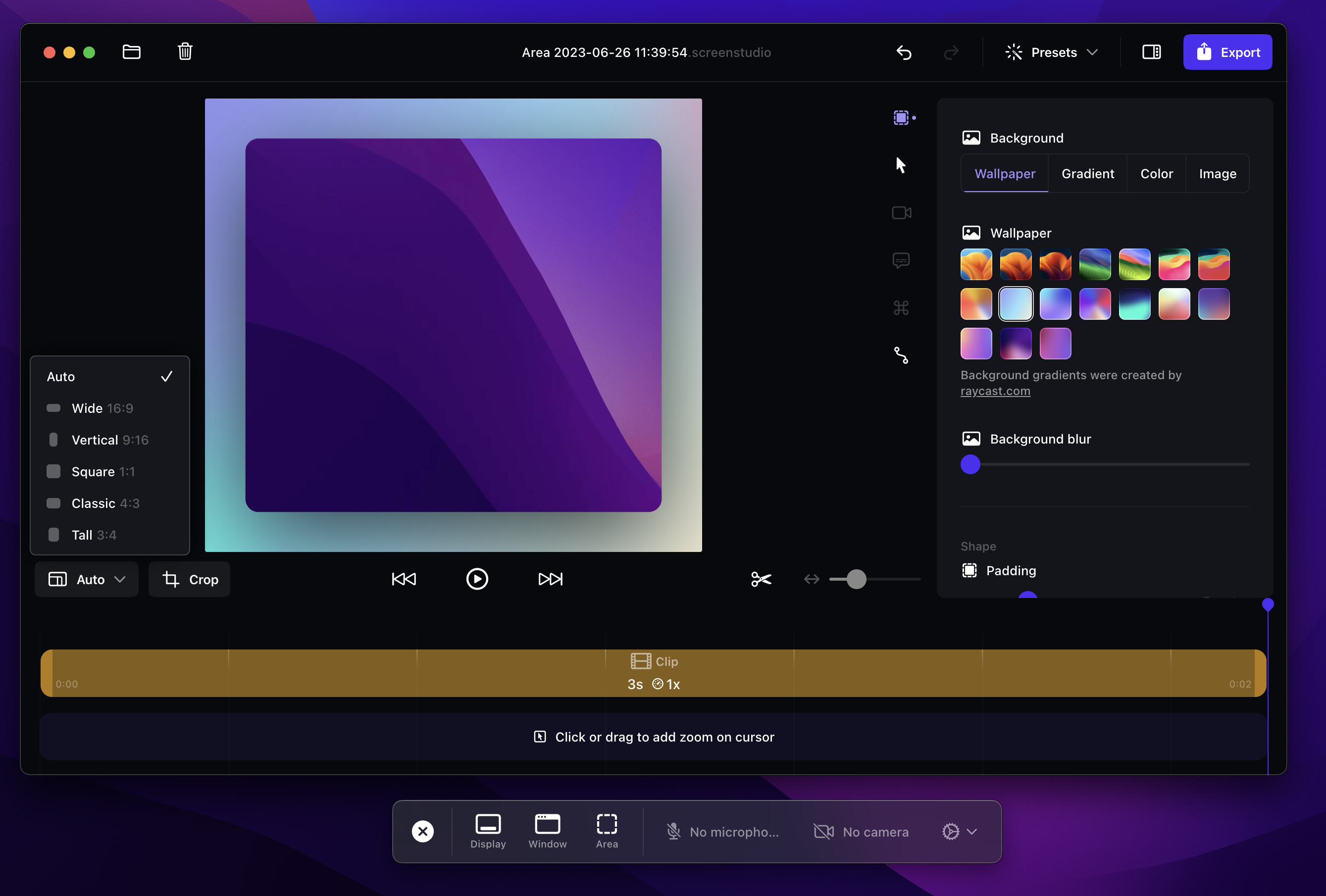
An interesting hybrid approach was used by the Creator of Screen Studio, an application for recording video of our activity on the computer. The application interface is built as a web one, but it uses native capabilities to create an overlay for recording control and a menu bar widget.
I think that web technologies will become more and more popular in the web application category. This approach allows flexibility in constructing a team of developers and provides great opportunities for application distribution and quick release of changes. You can see it now with the sudden appearance of AI. Web applications are rapidly adding new features using, for example, the OpenAI API, and these types of features are not yet popular among their native counterparts. I hope that technologies such as React Native will allow better integration of web applications with the operating system and I will still be able to see little polished details as dropdown going outside the window of app to better show its content.